Friday 22 April 2016
Tuesday 19 April 2016
Sunday 17 April 2016
Friday 15 April 2016
Evaluation Question 1
Here is a video of my talking through the above Prezi with more explanation...
Sunday 10 April 2016
Saturday 2 April 2016
How and Why- Poster
I made this video to talk through the decisions I made with my poster, why I made them and how I made the poster...
Friday 1 April 2016
Previous Decisions I Went Against For the Final Piece
There were some things that I had planned to do that I decided to go against by the time it came to filming and editing the trailer.
First of all, Make-Up.
I had planned to do make up on James to show how ill the possession had made him and also to create a few disturbing images throughout the trailer. I ultimately went against this as there were no scenes within my trailer of 'Freddie' post-possession and so the make up wasn't needed. I chose not to include any scenes of Freddie post possession as I thought it would be effective in keeping the audience guessing what happened to Freddie when he opened the music box and why his sister, Lauren is so scared.
There were also changes with the amount of voiceover and speech I put in the trailer...
I originally planned to have a voiceover at the beginning of the trailer which showed Lauren saying that everything was going well when they moved in to the new house but then things started to go wrong- as a way to guide the audience, however after recording this voiceover and importing it into my trailer, I decided not to include it as it didn't fit in the way I wanted it to and I thought that the trailer had more mystery without it. I did however, include a small part towards the middle where Lauren says 'I have to find out what happened here, I have to save my brother' to show what was going on it those clips where she is typing.
Saturday 26 March 2016

Friday 25 March 2016
TRAILER FINAL CUT with Changes from feedback
I've finished my trailer! I had a few adjustments to make after I showed it to James and Sophie, the lead actors, I recorded their response below..
*****
I changed the keyboard scene to one where you could see what she was typing as it made more sense and gave a clue. I also made the title at the end pop a bit more by adding a black screen before it which switched to the title on the beat of the music.
Thursday 24 March 2016
I put both of my ancillary products at their current stages on Facebook to see what people thought- I asked for feedback.
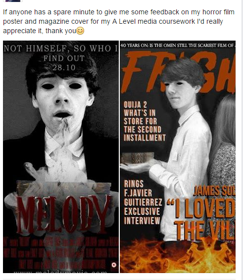
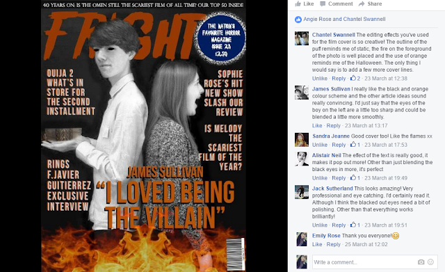

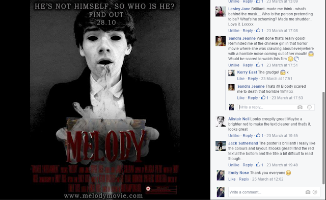


I got lots of positive feedback but some people also gave me constructive criticism...

and so I changed the eyes to make them look more professional and polished.
 |
| Now |
 |
| Before |
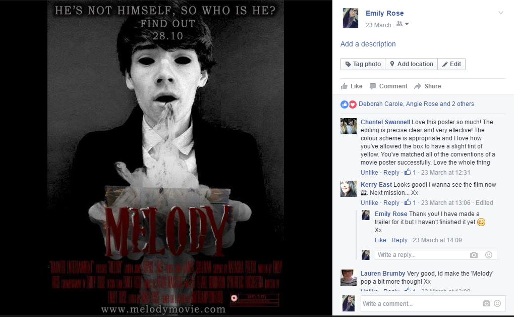

A few people said that the title could have been brighter and popped more so I added a white outline,

Evaluation notes
1. In what
ways does your media product use, develop or challenge forms and conventions of
real media products?
·
My media product, a horror trailer, uses and conforms
to typical conventions of existing products- this was my initial intention as I
wanted to appeal to my target audience who are comfortable with the media they
receive perhaps on a daily basis. When beginning the process I likened my plot
ideas to the existing horror films- the Possession, Insidious and Paranormal
Activity which in my opinion also conform to genre conventions.
·
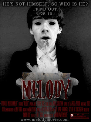
The title of my film is ‘Melody’ which is a simplistic
title and is a clear relation to the plot of the film- once the victim turned
villain opens the music box, consequently hearing the melody, he becomes
possessed. From my research I did find that horror trailers stylistically are
simple and immediately reveal the key plot points to the audience – Paranormal
Activity, the Possession. CHALLENGE I somewhat challenged the title conventions
however when you consider the pleasant tone associated with the word melody in
contrast to the straightforwardly ominous ‘the Possession’ or ‘Sinister’, but
in terms of binary oppositions, which I have seen elsewhere in horror titles
like ‘the visit’, my trailer develops this title convention with a sense of
ambiguity which is almost more unpleasant.
·
The primary location of my trailer challenges the
typical isolated image associated with horror films as I chose to film all of
my scenes within the characters’ home which I think has an eerie feel to it as
it creates fear within the audience as the typical sense of security that you
feel in your own home is challenged in contrast to isolated forests or dark
alleys which although commonly associated with horror, are relatable to less
people as you can chose whether or not to put yourself in those situations. I
chose to go down this route, in a similar to Paranormal Activity in that the
scenes where films entirely in the home as it still manages to create a sense
of isolation due to no one else being around, without filming in a forest which
would have not only have not fitted my plot but also would have been difficult
for me to film as my equipment may have gotten damaged.
·
In terms of costume I had an idea consistently
throughout, I wanted my characters to look like typical teenagers and so when
planning for filming and photoshoots I asked them to wear their typical
clothes, ultimately this had the desired effect and I think it makes the film,
it’s events and the characters seem more relatable to the target audience, who
are of a similar age, as the characters look like them or their friends. This is not unusual of horror films but
instead of portraying Lauren, the lead female protagonist, as a typical teenage
girl I could have used one of the typical horror character conventions and
sexualised her appearance in order to comply to the male gaze theory as then,
some of the male audience would have been watching to see an attractive girl in
provocative clothing. –
USES AND GRATIFICATIONS
·
The names of my characters develop conventions of
certain existing horror films in the sense that they pay homage to popular
horror films like Freddie Kreugar- the villain in nightmare on elm street and
Laurie Strode the strong female protagonist in Halloween. This is a convention
which some creators chose to use for intertextuality between horror films which
is appealing to the target audience or horror movie fans.
·
The music I chose is Intractable Demons by Matt Gates
which is a high tension piece of music, intense music is typically used in
horror trailers to increase the heartbeat of the audience thus putting them on
edge as they are aware something is about to happen. I chose to go with a piece
of music rather than a song as I felt that lyrics would distract the audience
from the action on screen, this uses a common convention but also challenges a
more recent one wherein horror trailers use binary oppositions, creating a
pleasant image and tone at the start in contrast to the end. To do this they
use happy, cheery songs at the start of the trailer – The Visit.
·
Propp- used conventions
·
I used low lighting throughout the trailer to create a
similar ambiance to that of existing trailers, I was unable to use low lighting
in some of the scenes at the filming stage and so I created this in the editing
process by reducing the brightness by over half.
·
In terms of structural conventions for the trailer I
added a BBFC slide at the start to show that my trailer was only suitable to
appropriate audiences, and a production company logo which I created myself
using Photoshop. The title is at the end and I added a scary scene after the
music loses its intensity and volume to make the audience jump, this is
something that I’ve seen in other trailers such as The Boy. After this I added
a slide which incorporates new media- twitter and Facebook so that the audience
can connect with and learn more about the film.
·
Throughout the trailer I incorporated typical
conventions and clichés of plot points within existing horror films and trailers,
such as the found footage style of filming which I developed and chose to do
only at the start of the trailer to give more of a variety- Paranormal
activity, screaming which is a typical motif associated with horror and also
blood.
·
Horror films almost always incorporate the fight of a
protagonist against an antagonist, by making this fight between siblings, and
even more so between twins, it intensifies the horror aspect as it makes the
audience challenge their security within their own family. Twins are an image
often seen in horror films such as the shining and the tale of two sisters but
I chose to develop this convention by making the twins fight against each other
to give the sense that the sister knows there is something wrong with her
brother even when no one else does.
·
Todorov’s narrative theory of disequilibrium vs.
equilibrium is one I tried to incorporate into my plot as it keeps the audience
engaged while giving them a break from the intensity, in films like The Blair
Witch Project this theory was not followed and in my opinion this had a
negative effect on the film and so I was eager to follow the theory.
·
Enigma- use
·
Camera shots- Close ups, Found footage handheld –
PARANORMAL ACTIVITY, Perspective shot , Mirror shot – PARANORMAL ACTIVITY, BCU –
PSYCHO, Wide – SINISTER, LOW ANGLE.
·
Posted on YouTube
2. How effective
is the combination of your main product and ancillary tasks?
·
An effective element which is carried through all
three of my products is the sense of enigma. In the poster the audience see
Freddie becoming possessed, whereas with the magazine cover they can see him as
the antagonist due to the comparison against Lauren who is screaming. This
makes them want to watch the trailer, and ultimately the film, to learn more
about what actually happens.
·
An image consistently used throughout the three
products is the music box which is the pivotal object for the plot, thus the
products give the audience some information about the plot, but not too much
that it gives anything away. The music box also makes each of the products
identifiable to my film.
·
Barthes enigma codes
·
Uses and gratifications
·
A.I.D.A – black eyes
·
Both images on magazine and cover were black and white
but I chose not to carry this through to my trailer as I feel it looks a lot
better in print products.
·
Synergy in mise-en-scene – dark and gloomy, representations
of characters – both victims to a greater force.
3. Audience
feedback
·
Put poster and magazine on facebook to get feedback-
insert feedback
·
Changed poster- colour
·
Changed magazine- eyes
·
Importance of facebook for feedback- widespread
audience, variety of answers, 2nd and 3rd audiences
·
Old posters and magazine – show my development because
of audience feedback, last time w/ posters
·
Questionnaires to drive my plot
·
Survey monkey to finalise my title
·
Small focus groups- help me to know what they mean,
sophie and james video – what they said and how I worked on it – changed title
bit of trailer and also filmed a different scene.
·
Audience feedback= so important in knowing what your
TA want to receive
Sunday 20 March 2016
Almost Done!
I have been editing my trailer all weekend and also filming scenes that I had left to do.
I've recorded the entire making process on my laptop and I'll upload that along with the almost-finished trailer later on.
I've recorded the entire making process on my laptop and I'll upload that along with the almost-finished trailer later on.
Saturday 19 March 2016


Friday 18 March 2016
Music Update
I decided against the last piece of music I chose because it didn't sound scary enough and so I typed 'horror trailer music' into YouTube and found a piece of music called 'Intractable Demons' which I really like.
As I was watching I was already thinking about how I'd edit the trailer to fit to the music and I think it's going to work really well.
As I was watching I was already thinking about how I'd edit the trailer to fit to the music and I think it's going to work really well.
Tuesday 15 March 2016

Sunday 13 March 2016
Sinister Trailer
This weekend I have been continuing to edit my trailer together and I have been watching horror trailers to get some ideas for the text inbetween clips.
One of the trailers I looked at was Sinister which contained something that I really liked; at the start it has flashes of pictures to do with the victims and the plot. I thought I could do this- pictures of Lauren and Freddie laughing and being happy instead of the footage that I had planned to do as I am not going to have enough space in my trailer for extra footage. I could also then flash images of the music box in between to foreshadow what's going to happen.
I also liked how they had alternating clips of the video tapes playing and the bad things happening as it shows they are an effect of the video tapes. - I could do this with my music box too.
Friday 11 March 2016
Thursday 10 March 2016
Tuesday 8 March 2016

Monday 7 March 2016
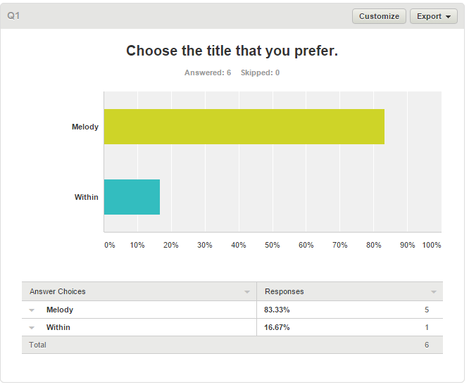
Narrowing Down a Title
This was the data I received from my survey. The 'other' answers were Music Box, Within, The Dust, Just Breathe and Airborn.


I really like Within as well so I am unsure of which one to pick. Because of this I created another survey with just those 2 titles and hopefully this will help me decide...
https://www.surveymonkey.co.uk/r/NRHM6J8
Friday 4 March 2016

Planning of My Film Magazine
I've sketched what I'd like my film magazine cover to look like

I am going to use this image


I am going to use this image


Thursday 3 March 2016
Billing Block
Here's what I put in my billing block
*PRODUCTION COMPANY* PRSENTS “THE MUSIC BOX” LAUREN JONES SOPHIE ROSE FREDDIE JONES JAMES SULLIVAN SUPPORT BY NATASHA PRETOT WRITTEN BY EMILY ROSE CINEMATOGRAPHY BY EMILY ROSE DESIGN EMILY ROSE MUSIC BY KEVIN MACLEOD AND THE BLAKE ROBINSON SYNTHETIC ORCHESTRA DIRECTED BY EMILY ROSE EDITED BY EMILY ROSE FILMED ON LOCATION IN NORTHAMPTONSHIRE

Wednesday 2 March 2016
Title Survey
I created a survey to try and find a title...
https://www.surveymonkey.co.uk/r/ZZQN2FK
and asked some of my friends to fill it out. Hopefully I will get lots of replies..
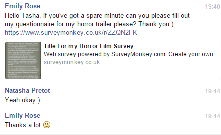


https://www.surveymonkey.co.uk/r/ZZQN2FK
and asked some of my friends to fill it out. Hopefully I will get lots of replies..
**************
****************
Decision on My Type of Magazine
After doing my research on different types of horror magazine- general magazine horror issus and specifically targeting horror magazines, I've decided that I'm going to do the latter - a horror magazine.
So now I can start making...
So now I can start making...
Tuesday 1 March 2016
Editing Software: Adobe Premiere Pro
I got the program Adobe Premiere Pro to edit my trailer in a more professional and sophisticated way than I thought I would be able to do on Windows Movie Maker.
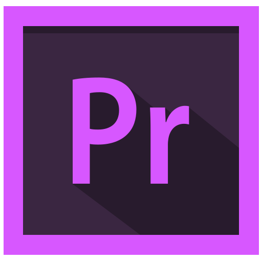
I found the program difficult to use at first but after watching various YouTube tutorials I felt like I could figure out what to do. However the program had a glitch which made it near impossible for me to edit the trailer as it was jump past things and it had lag which made the audio out-of-sync with the visuals.
I searched google to find how to fix this problem and found that it was common amongst users of the version of the program which I had, a friend told me to 'render' the video and that would work but unfortunately it didn't and so I decided I would just continue using Windows Movie Maker.
Sunday 28 February 2016
Editing Software : Windows Movie Maker
Everything that I have filmed so far I have then edited using Windows Movie Maker as I have used this software many times before and so I know what all of the tools do and how to use them.


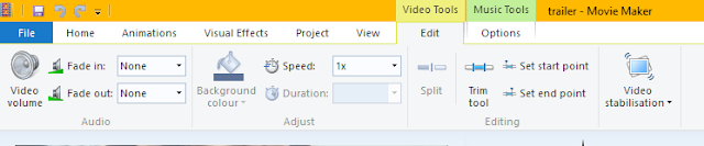
Here are all the video tools, you can change the volume and speed and also trim videos to cut out the parts which you don't like. This works well for me when there is a part of a video clip when we are talking or I am telling people what to do.


This is what the site looks like altogether and as you can see there are a lot of different windows and tools.

Here is where you can add music, photos and video to your project and also text screens.

The 'emphasise narration' tool is going to be good for when I film the voiceover.

Here are all the video tools, you can change the volume and speed and also trim videos to cut out the parts which you don't like. This works well for me when there is a part of a video clip when we are talking or I am telling people what to do.
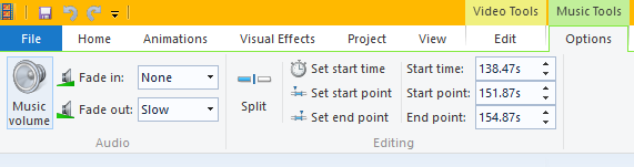
These are the music tools which work the same as video tools.

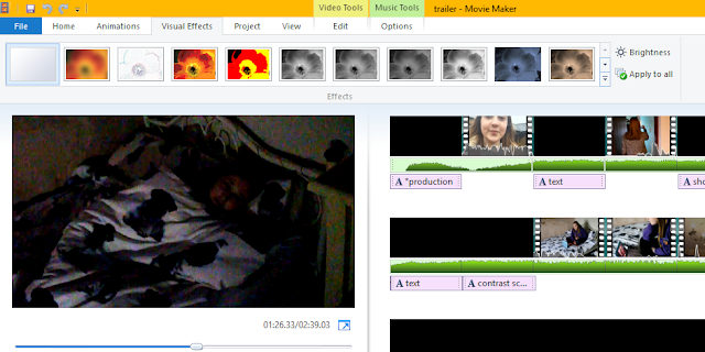
These scene was very dark as I had a lack of lighting due to it being a night time scene so I increased the brightness of the clip.
Friday 26 February 2016
Locations Update
As I was struggling to get everyone together to film at tasha's house for the remaining scenes- the attic I was thinking of alternative.
At school our drama studio has lots of different cupboards which my teacher showed to me and the mise-en-scene is perfect for a cluttered attic ...
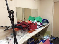


I think the mirror could provide a good shot of the moment which James gets possessed.
This is the other cupboard which I don't think would be as good/easy to film in but I like the stuff that's in there as it looks more like a house than a school so I could move some things from there into the other cupboard.

At school our drama studio has lots of different cupboards which my teacher showed to me and the mise-en-scene is perfect for a cluttered attic ...


I think the mirror could provide a good shot of the moment which James gets possessed.
This is the other cupboard which I don't think would be as good/easy to film in but I like the stuff that's in there as it looks more like a house than a school so I could move some things from there into the other cupboard.

How I Did My Poster: Images

With the black and white filter option I moved the yellow levels to the right which made any yellow tones in the photo whiter rather than black or grey- there were yellow tones in James' skin and so that's why he's so pale.
I then coloured in his eyes using a black paintbrush on Photoshop

For the second image I did the same technique with the black and white filter, sliding the yellow levels to the left.
I used an effect filter which was called 'crayon and chalk' that created the texture within the image.
I then de-saturated the image to get it even darker and greyer.
I lost some of the bright-whiteness in his skin when I applied the filter and so I upped the exposure which brightened any white levels.

I added a 'posterize' filter to this which created a cartoon effect and then I did the same black and white technique.
I am going to print each of these out and ask people what they think/ which one they prefer. Personally I prefer the first one as I think it has the most attention on James' character.
Wednesday 24 February 2016
Music
I've found that the music I picked out for the trailer already is not very suspenseful as it doesn't build up tension throuhgout like the trailer does, but as I really like it I was looking for another piece of music to maybe layer over the top of it and my friend from my media group found this which he thought would work well...
I really like it as it fits with the music box theme and sounds very creepy so I'm going to try it out.
I really like it as it fits with the music box theme and sounds very creepy so I'm going to try it out.
Poster Improvements
I am currently improving my poster from the feedback I got from my first drafts. I am focusing on eyes because everyone said they thought it was effective last time. I am using photoshop to create my poster and have found a lot of helpful websites on editing horror poster and generally how to use photoshop.
http://www.filmsourcing.com/blog/2013/creating-a-horror-poster-tutorial/
These are the 3 base images I've created and I'm going to show them to my media group and friends tomorrow and do a focus group before I add text and details to them. I'll add a post tomorrow on how I did these...


http://www.filmsourcing.com/blog/2013/creating-a-horror-poster-tutorial/
These are the 3 base images I've created and I'm going to show them to my media group and friends tomorrow and do a focus group before I add text and details to them. I'll add a post tomorrow on how I did these...


Subscribe to:
Posts (Atom)