Showing posts with label Evaluation. Show all posts
Showing posts with label Evaluation. Show all posts
Friday, 22 April 2016
Tuesday, 19 April 2016
Sunday, 17 April 2016
Friday, 15 April 2016
Evaluation Question 1
Here is a video of my talking through the above Prezi with more explanation...
Sunday, 10 April 2016
Saturday, 2 April 2016
How and Why- Poster
I made this video to talk through the decisions I made with my poster, why I made them and how I made the poster...
Friday, 1 April 2016
Previous Decisions I Went Against For the Final Piece
There were some things that I had planned to do that I decided to go against by the time it came to filming and editing the trailer.
First of all, Make-Up.
I had planned to do make up on James to show how ill the possession had made him and also to create a few disturbing images throughout the trailer. I ultimately went against this as there were no scenes within my trailer of 'Freddie' post-possession and so the make up wasn't needed. I chose not to include any scenes of Freddie post possession as I thought it would be effective in keeping the audience guessing what happened to Freddie when he opened the music box and why his sister, Lauren is so scared.
There were also changes with the amount of voiceover and speech I put in the trailer...
I originally planned to have a voiceover at the beginning of the trailer which showed Lauren saying that everything was going well when they moved in to the new house but then things started to go wrong- as a way to guide the audience, however after recording this voiceover and importing it into my trailer, I decided not to include it as it didn't fit in the way I wanted it to and I thought that the trailer had more mystery without it. I did however, include a small part towards the middle where Lauren says 'I have to find out what happened here, I have to save my brother' to show what was going on it those clips where she is typing.
Thursday, 24 March 2016
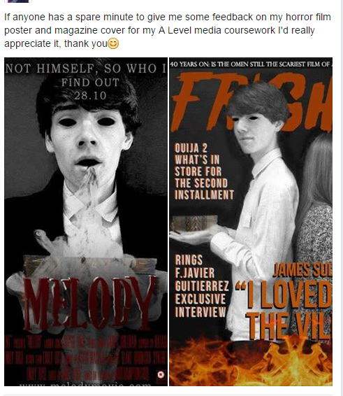
I put both of my ancillary products at their current stages on Facebook to see what people thought- I asked for feedback.


I got lots of positive feedback but some people also gave me constructive criticism...

and so I changed the eyes to make them look more professional and polished.
 |
| Now |
 |
| Before |


A few people said that the title could have been brighter and popped more so I added a white outline,


Evaluation notes
1. In what
ways does your media product use, develop or challenge forms and conventions of
real media products?
·
My media product, a horror trailer, uses and conforms
to typical conventions of existing products- this was my initial intention as I
wanted to appeal to my target audience who are comfortable with the media they
receive perhaps on a daily basis. When beginning the process I likened my plot
ideas to the existing horror films- the Possession, Insidious and Paranormal
Activity which in my opinion also conform to genre conventions.
·
The title of my film is ‘Melody’ which is a simplistic
title and is a clear relation to the plot of the film- once the victim turned
villain opens the music box, consequently hearing the melody, he becomes
possessed. From my research I did find that horror trailers stylistically are
simple and immediately reveal the key plot points to the audience – Paranormal
Activity, the Possession. CHALLENGE I somewhat challenged the title conventions
however when you consider the pleasant tone associated with the word melody in
contrast to the straightforwardly ominous ‘the Possession’ or ‘Sinister’, but
in terms of binary oppositions, which I have seen elsewhere in horror titles
like ‘the visit’, my trailer develops this title convention with a sense of
ambiguity which is almost more unpleasant.
·
The primary location of my trailer challenges the
typical isolated image associated with horror films as I chose to film all of
my scenes within the characters’ home which I think has an eerie feel to it as
it creates fear within the audience as the typical sense of security that you
feel in your own home is challenged in contrast to isolated forests or dark
alleys which although commonly associated with horror, are relatable to less
people as you can chose whether or not to put yourself in those situations. I
chose to go down this route, in a similar to Paranormal Activity in that the
scenes where films entirely in the home as it still manages to create a sense
of isolation due to no one else being around, without filming in a forest which
would have not only have not fitted my plot but also would have been difficult
for me to film as my equipment may have gotten damaged.
·
In terms of costume I had an idea consistently
throughout, I wanted my characters to look like typical teenagers and so when
planning for filming and photoshoots I asked them to wear their typical
clothes, ultimately this had the desired effect and I think it makes the film,
it’s events and the characters seem more relatable to the target audience, who
are of a similar age, as the characters look like them or their friends. This is not unusual of horror films but
instead of portraying Lauren, the lead female protagonist, as a typical teenage
girl I could have used one of the typical horror character conventions and
sexualised her appearance in order to comply to the male gaze theory as then,
some of the male audience would have been watching to see an attractive girl in
provocative clothing. –
USES AND GRATIFICATIONS
·
The names of my characters develop conventions of
certain existing horror films in the sense that they pay homage to popular
horror films like Freddie Kreugar- the villain in nightmare on elm street and
Laurie Strode the strong female protagonist in Halloween. This is a convention
which some creators chose to use for intertextuality between horror films which
is appealing to the target audience or horror movie fans.
·
The music I chose is Intractable Demons by Matt Gates
which is a high tension piece of music, intense music is typically used in
horror trailers to increase the heartbeat of the audience thus putting them on
edge as they are aware something is about to happen. I chose to go with a piece
of music rather than a song as I felt that lyrics would distract the audience
from the action on screen, this uses a common convention but also challenges a
more recent one wherein horror trailers use binary oppositions, creating a
pleasant image and tone at the start in contrast to the end. To do this they
use happy, cheery songs at the start of the trailer – The Visit.
·
Propp- used conventions
·
I used low lighting throughout the trailer to create a
similar ambiance to that of existing trailers, I was unable to use low lighting
in some of the scenes at the filming stage and so I created this in the editing
process by reducing the brightness by over half.
·
In terms of structural conventions for the trailer I
added a BBFC slide at the start to show that my trailer was only suitable to
appropriate audiences, and a production company logo which I created myself
using Photoshop. The title is at the end and I added a scary scene after the
music loses its intensity and volume to make the audience jump, this is
something that I’ve seen in other trailers such as The Boy. After this I added
a slide which incorporates new media- twitter and Facebook so that the audience
can connect with and learn more about the film.
·
Throughout the trailer I incorporated typical
conventions and clichés of plot points within existing horror films and trailers,
such as the found footage style of filming which I developed and chose to do
only at the start of the trailer to give more of a variety- Paranormal
activity, screaming which is a typical motif associated with horror and also
blood.
·
Horror films almost always incorporate the fight of a
protagonist against an antagonist, by making this fight between siblings, and
even more so between twins, it intensifies the horror aspect as it makes the
audience challenge their security within their own family. Twins are an image
often seen in horror films such as the shining and the tale of two sisters but
I chose to develop this convention by making the twins fight against each other
to give the sense that the sister knows there is something wrong with her
brother even when no one else does.
·
Todorov’s narrative theory of disequilibrium vs.
equilibrium is one I tried to incorporate into my plot as it keeps the audience
engaged while giving them a break from the intensity, in films like The Blair
Witch Project this theory was not followed and in my opinion this had a
negative effect on the film and so I was eager to follow the theory.
·
Enigma- use
·
Camera shots- Close ups, Found footage handheld –
PARANORMAL ACTIVITY, Perspective shot , Mirror shot – PARANORMAL ACTIVITY, BCU –
PSYCHO, Wide – SINISTER, LOW ANGLE.
·
Posted on YouTube
2. How effective
is the combination of your main product and ancillary tasks?
·
An effective element which is carried through all
three of my products is the sense of enigma. In the poster the audience see
Freddie becoming possessed, whereas with the magazine cover they can see him as
the antagonist due to the comparison against Lauren who is screaming. This
makes them want to watch the trailer, and ultimately the film, to learn more
about what actually happens.
·
An image consistently used throughout the three
products is the music box which is the pivotal object for the plot, thus the
products give the audience some information about the plot, but not too much
that it gives anything away. The music box also makes each of the products
identifiable to my film.
·
Barthes enigma codes
·
Uses and gratifications
·
A.I.D.A – black eyes
·
Both images on magazine and cover were black and white
but I chose not to carry this through to my trailer as I feel it looks a lot
better in print products.
·
Synergy in mise-en-scene – dark and gloomy, representations
of characters – both victims to a greater force.
3. Audience
feedback
·
Put poster and magazine on facebook to get feedback-
insert feedback
·
Changed poster- colour
·
Changed magazine- eyes
·
Importance of facebook for feedback- widespread
audience, variety of answers, 2nd and 3rd audiences
·
Old posters and magazine – show my development because
of audience feedback, last time w/ posters
·
Questionnaires to drive my plot
·
Survey monkey to finalise my title
·
Small focus groups- help me to know what they mean,
sophie and james video – what they said and how I worked on it – changed title
bit of trailer and also filmed a different scene.
·
Audience feedback= so important in knowing what your
TA want to receive
Monday, 1 February 2016
Targets From Now On
Instead of carrying on with my weekly targets, I realised that as they are going to be similar from now on, I am just going to write my targets on here now,
- Find a piece of music that I want for my trailer.
- Film
- Edit
- Poster
- Magazine
Friday, 29 January 2016
Did I Meet My Targets 29th January
My target for this week was to create characters profiles, I did this using prezi and now my characters have names and identities.
Monday, 25 January 2016
Targets For This Week 25th January
My main target for this week is to create character profiles for my two lead roles.
Friday, 22 January 2016
Did I Meet My Targets 22nd January
My targets for this week were to research into horror director's style and institutions, I have done both of these things. This has helped me to develop my own filming style and think about including some of the things used by these directors into my own horror film.
My institutions research has helped me to decide that I am going to create my own horror production company, rather than using an existing, popular production company to release my film.
My institutions research has helped me to decide that I am going to create my own horror production company, rather than using an existing, popular production company to release my film.
Monday, 18 January 2016
Targets For This Week 18th January
My targets for this week are to
- Research into famous horror director's style and institutions for horror films.
Friday, 15 January 2016
Did I Meet My Targets 15th January
A few weeks ago I set myself some targets...
- Take more images for the poster/ the magazine
- Create a shopping list for props and get these props
I took some more images this week and also I have now got all of my props so I can start filming.
Monday, 28 December 2015
Targets For The Next Few Weeks 28th December
My targets currently are to
- Create a shopping list of props which I need to get for filming, as now I have my camera- I am ready to film as soon as I get the props
- I also need to take new images for my poster/magazine with my new camera as the quality is better.
Saturday, 19 December 2015
Summary of Poster Focus Groups
I have made a Prezi of a summary from my focus group, I am going to improve the posters with this feedback and then show them again.
Friday, 18 December 2015
Did I Meet This Targets 18th December
I evaluated the small clips that I filmed last week so that I know how to better improve when it comes to filming and editing the real thing.
I also held a focus group on my draft posters, which I recorded, and now I know which of my posters to develop.
I have also been researching film magazines and already have a better understanding to prepare me for creating the real thing.
I also held a focus group on my draft posters, which I recorded, and now I know which of my posters to develop.
I have also been researching film magazines and already have a better understanding to prepare me for creating the real thing.
Thursday, 17 December 2015
Quantitative Results from Focus Group on Poster Drafts
I gathered all of my results together and made some graphs...


As you can see the preferred poster this one

Around 54% of the 11 people I asked said this was their favourite, 5/6 of these people were between the age of 17-18 which I think is important as it shows that young people ie. my target audience found the scariest poster the best, thus emphasising why they're my target audience because it shows that most young people love horror.

Whereas 27% of the people asked said they preferred this one, 2/3 of these were my mum and dad who are obviously over 40 and again, I think this is important as it shows why they are not my main target audience. However, this could've meant that they thought the one with the black eyes was too scary and they wouldn't want their children to see it: so I asked my mum if she thought any of the posters were too scary to be put around public places where children could see them and she disagreed.

Finally, around 18% chose this poster as their favourite because they thought it looked original, however neither of them said it was particularly scary or prominent as a horror poster just that it was unsettling as his face is blurred.
Tuesday, 15 December 2015
Other Poster Feedback
Aside from my recorded focus groups, I asked people what they thought without recording.
Victoria said that she preferred the poster with the black eyes because it looked unsettling and she immediately thought of the horror genre. I asked her if she had any improvement ideas and she said the same as everyone else in that she thought a brighter font was needed as it was hard to read, she also said that it would be interesting to put a sepia toned filter over the image to create an aged, creepy look.
To get a wider age range I also asked my mum and dad to tell me what they thought...
My mum said she preferred the poster with both Sophie and James because he looks very sinister and she thought it was the best picture. She said that it wasn't too scary and she couldn't really tell that it was a horror film whereas with the other two, she could. She said with the poster she preferred, she would use more make up to make James look scarier and also have Sophie staring towards the camera like James is and to make her look more like she's screaming. My dad also preferred this poster.
Subscribe to:
Posts (Atom)