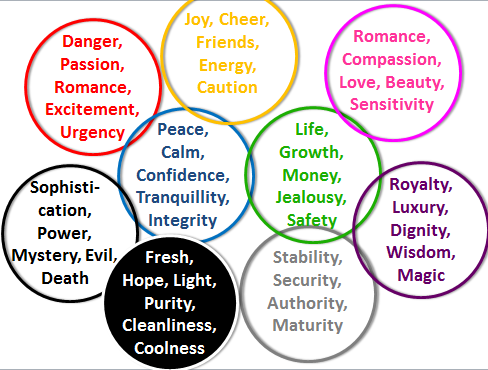
I think that genres tend to be associated with particular colours- they help the audience who are looking at the poster know what type of film it is. For example if you saw a poster primarily coloured with blacks and greys and red you would guess it's a horror and not a comedy. On the contrary, pink and reds are associated with romantic comedy films or 'chick- flicks'.
I found more examples of this by grouping my DVD's into genres and you can clearly see the colour patterns within the specific genres. This is going to help me when I make my poster because I'll have more of an understanding of what colours and fonts to use depending on the genre I pick.
Kids films
- Kids films tend to be bright and fun to appeal to the young target audience.
- There is lots of blue and fun, swirly fonts.
- These are all black/ dark which is expected from horror films.
- There's also red which can symbolise danger
- The fonts are similar and quite gothic
Romance films
- The fonts for the romance films tend to be quite basic
- There's a lot of white and blue - purity and tranquillity
Romantic Comedy
- All of these feature red or pink which symbolise love
- The fonts are quite bold


No comments:
Post a Comment